
What Substack Doesn't Tell You About Cover Images
The Substack Cover Safe Zone Guide. Make your Substack covers look great across all 9 previews. Prompt, Figma template, and Canva template included.


I dare you to find one image generation model neither one of us has tried. But even with all of them at our disposal, we both spend a frankly ridiculous amount of time making our newsletter covers look good.
So when Substack takes these lovingly overthought creations and makes them look gorgeous in one place, then deranged in another, we get annoyed.
There’re at least nine preview sizes one image has to survive. And sure, if it doesn’t, a normal person says, “Good enough.” Sadly, some of us see the broken thumbnail and can’t return to peace.
So we got to work. Mostly AI Meets Girlboss did, while I performed the noble supporting role of asking questions. If you’re not familiar with AI Meets Girlboss, she’s the person behind the recent visual revolution on Substack. She’s saved countless writers from their original design choices and showed them how to stand out.

What’s Inside
The Nine Lives of a Substack Image
The Safe Zone
Inside the Safe Zone
Prompt, Figma, and Canva Templates

Hey, I’m Karo Zieminski 🤗.
I write Product with Attitude, an AI newsletter for tens of thousands of readers across 146 countries, helping them develop critical AI literacy the only way it sticks: through practice.
I want my readers to enjoy the whole experience of interacting with my publication. Assuming at least some of them are like me, and therefore perfectly capable of noticing a strangely cropped cover image, I asked AI Meets Girlboss to help map a system that, as far as I know, does not yet exist.
Today’s article was written by her, edited by yours truly, and comes with a guidebook and Figma + Canva templates you can use straight away.
If you’re new here, welcome!


From AI Meets Girlboss:
One day I was scrolling through my own Substack homepage and noticed that the featured post thumbnail looked nothing like the cover I’d designed. My carefully centred character had been reduced to a headless torso adrift in a pink wasteland. The logo was partially gone. The title text? Presumably off to the left.
So when Karo reached out with the same problem, I went deep into the data. I measured all nine placements, calculated the safe zone, and brought her the findings. She’s turning them into Canva and Figma templates so anyone can use them without having to do the maths themselves.
Between us, we built something that should have existed already: a proper safe zone framework for Substack covers, plus a prompt you can use to generate images that survive every crop from the start.
The Nine Lives of a Substack Image
Substack shows your image in multiple places in the app and on the web: app, web, homepage, archive, small preview, banner. Each with its own crop, each grabbing a different portion of your original image.
At first, I assumed the small square thumbnail would be the problem.
It wasn’t.
Every resized version of the original design is.
Sometimes Substack shows your image as a wide, blurred strip. Other times as a small preview. In all scenarios only a small rectangle in the centre stays readable. Everything else outside that centre zone starts moving around. It may still look pretty, in theory, but most of the time it just doesn’t.
The Safe Zone
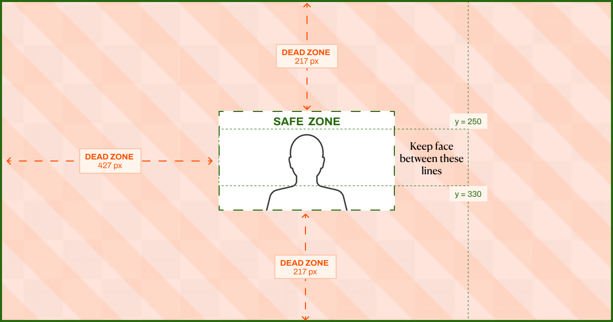
I measured the placements and calculated the tightest window on a 1200 × 630 canvas. The safe zone is a center 345 × 195 px rectangle. Smaller than you’d expect, isn’t it?

Centre 345 × 195 px: this is where everything that matters has to live.
427 px on each side: dead zone. Use it for background, texture, colour, tiny flamingos, emotional support. Nothing important.
217 px at the top and bottom: also dead, no-no zone.
Inside the Safe Zone
It also helps to understand the composition logic within the safe zone itself:
If you have text/logo + a character:
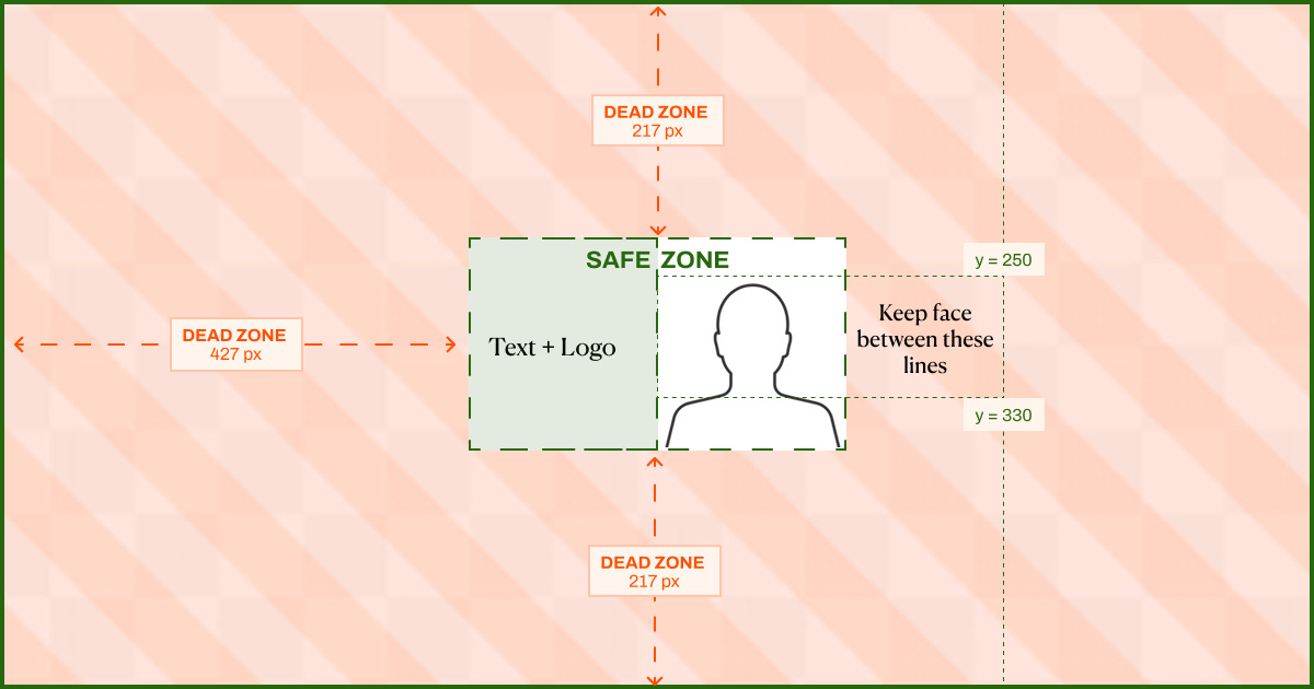
Text and logo go left of centre. Anything readable, like your title, publication name, or logo, belongs in the left half of the safe zone: canvas x 427–600. In the tightest crops, this is what still shows. In the largest crops, it anchors the composition.
Character or focal subject goes right of centre. Your character, or main visual element belongs in the right half of the safe zone: canvas x 600–772.
Keep the face, or the highest important point, around y 250–330 so it doesn’t get decapitated. Lovely sentence to have to write.
If you only have one of them:
Everything else is atmosphere.
The dead zones are for brand colour, texture, decorative elements (flamingos!) and whatever visual nonsense makes the cover feel like yours.
Prompt, Figma, and Canva Templates
To make this easy, we prepared three resources you can use right away.
Free Sizing Prompt (ChatGPT Images 2.0) by AI Meets Girlboss

Substack Cover Safe Zone | The Complete Toolkit + Claude Skill
by AI Meets Girlboss ($9)

Figma Template by Karo (Product with Attitude)

Canva Template by Karo (Product with Attitude)
Experiment with Smart Cropping
There’s a feature on Substack called Smart Cropping. Go to your Dashboard/Website/Homepage section, and next to “Cropping” select Center or Smart. Center plays it safe and crops around the middle. Smart focuses on what the algorithm reads as the most interesting part. Test both.
Try It and Tell Us What You Get
Try any of the resources we prepared for you and let us know if they helped.
If you want to go deeper on generating consistent, on-brand visual systems with AI (not just single covers, but a repeatable workflow across all your assets), I write about exactly that over at AI Meets Girlboss. The post on how to build a visual brand system that actually holds across every asset type is a good place to start. And if you want to know where ChatGPT Images 2.0 sits in the broader AI image generation landscape, I reviewed it properly here.
— Pinkie
A note from Karo
I met AI Meets Girlboss here on Substack back when she had fewer than 100 subscribers. Even then, she had that exceptional writing energy where you arrive curious and leave subscribed.
Today, she’s just a few subscribers away from becoming a bestseller. It’s a great time to support her.
More Reads on Substack and Design


WHY SUBSCRIBE ・YOUR BENEFITS・CRITICAL AI LITERACY・TOOLS I BUILT・CLAUDE HUB・PERPLEXITY HUB ・VIBE CODING HUB
Attitude Vault ・LinkSwap ・StackShelf
 | A guest post by
|
Loved collaborating with you, Karo. You’re exceptionally good at spotting topics that resonate, and you’re such a smart, generous partner in shaping ideas into something really useful for readers. I’m very sure this wasn’t our last collab. 🩷🦩
Thank you, this is incredibly helpful