

I Built a Runaway Subscribe Button. It Brought 70 New Subscribers in 6 Days. Code + Challenge Inside.
Most subscribe buttons are invisible because readers have seen too many of them. So I made mine misbehave.

TL;DR I built a subscribe button that dodges your cursor up to four times, then surrenders. In the 6 days since I added it, 70 people subscribed from my homepage. The static button was bringing in about half that per week. Full source code, the Claude prompt I used, GA4 wiring, and the accessibility fixes that keep it WCAG-friendly are below.
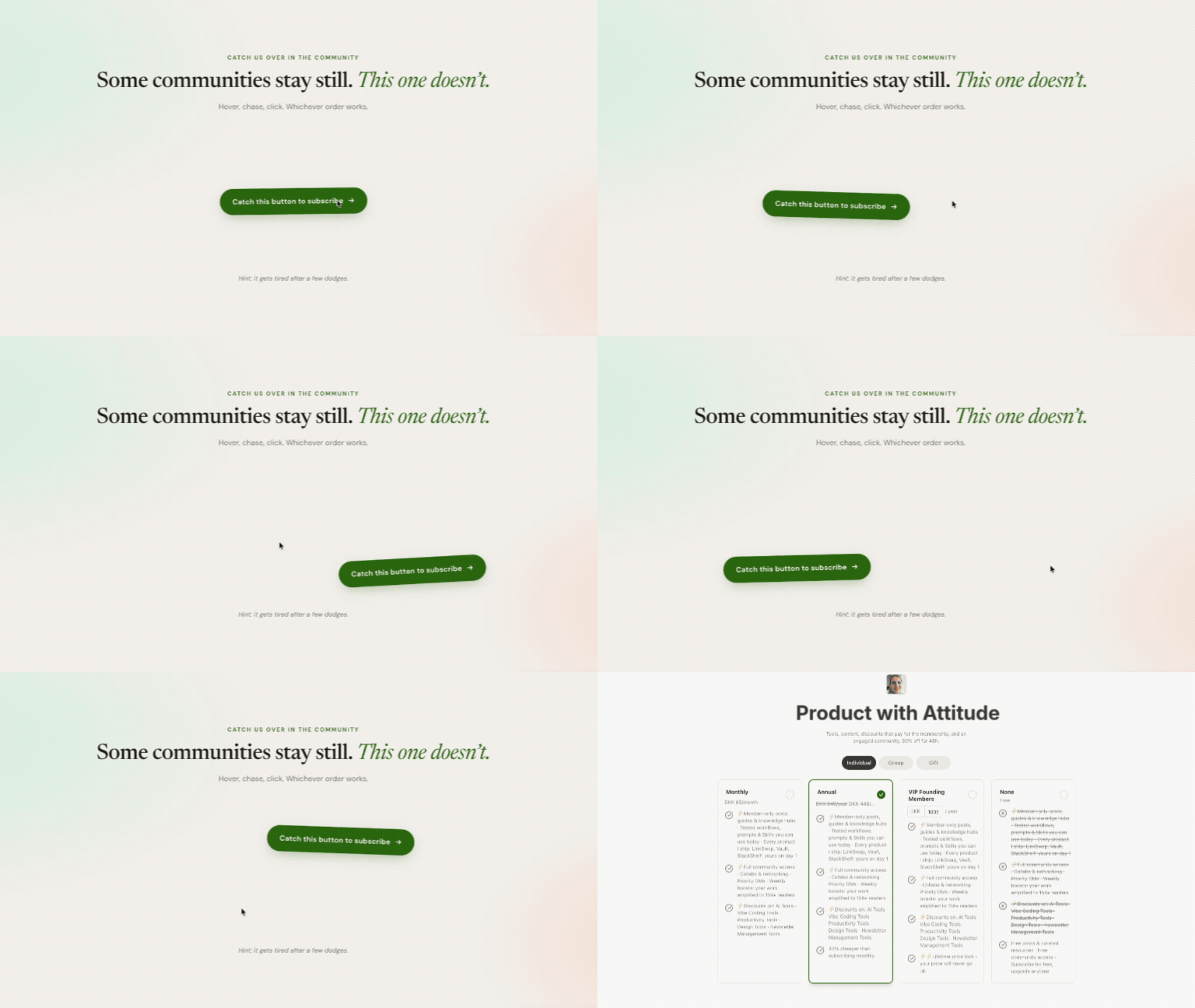
I built a subscribe button that runs away from your cursor.
I know. Who does that. I do that. Because it’s so counterintuitive, it sparked joy in a rebel like me. And I want more rebels to sign up for Product with Attitude.
Now the button runs from you.
You hover, it dodges. You chase, it dodges again. After the fourth dodge, it gives up. You can finally subscribe.
Making the subscribe button misbehave worked. In the six days since I added it, 70 people subscribed from my homepage. When it was just sitting there politely, the homepage brought in about half as many per week.
Today I’m breaking down the behavioral UX behind the experiment, showing you how I measure whether it works, and sharing the full source code so you can build your own mischievous little CTA.

Hey, I’m Karo Zieminski 🤗
AI Product Manager and builder.
I write Product with Attitude, an AI newsletter for thousands of subscribers developing critical AI literacy the only way it sticks: through practice.
We don’t just use AI. We build workflows, automations, and products with it, while studying how AI itself is built, positioned, and woven into our work.
If you’re new here, welcome! Here’s what you might have missed:


The Psychology Behind the Runaway Subscribe Button
Usually, a subscribe button behaves like a button. It sits and waits. Who said we can't turn it into a tiny game of digital tag?
That changes the psychology in a few ways.
1. It Creates Pattern Interruption
As readers, we've seen thousands of identical CTAs.
Subscribe now. Join today. Don’t miss out. Unlock full access.
Our brain has learned to scroll past them. A button that runs away breaks that autopilot. Our brain suddenly has to pay attention.
2. It Creates Benign Friction
Every UX 101 course tells you to kill friction. But not all friction is bad. Some friction is the whole point.
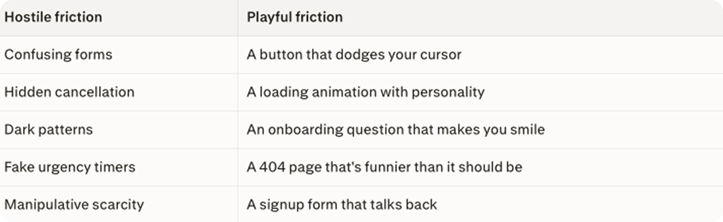
Friction has two forms. The hostile kind punishes the reader with fake urgency, locked exits, and confusion. The playful kind hands them a small puzzle and a payoff. Both create resistance. Only one earns trust.
3. It Creates a Curiosity Gap
The curiosity gap is the distance between what you know and what you suddenly need to know.
It is the same psychology behind good headlines, documentary intros, and YouTube thumbnails. The moment the button dodges, the reader has a new question: Wait. What just happened?
That half-second of surprise is the curiosity gap opening.
4. It Turns Conversion Into Play
And play lowers resistance.
5. It Shows a Personality
From “Click me” to “Catch me if you can.”
The button has attitude.
Selfishly, it also made me feel less needy about adding yet another subscribe button.
Good UX Means Everyone Can Still Use It
A playful button is only good UX if everyone can still use it.
That’s where my experiment connects to ethical design. While I wanted my button to be fun, I also want it to be accessible.
What Accessibility Means
Accessibility means building for the full range of human brains, bodies, devices, and contexts, not just for people with perfect eyesight, perfect motor control, and perfect concentration.
Accessibility includes people who:
rely on screen readers
have low vision or color blindness
get dizzy or distracted from motion
have motor difficulties
use a keyboard instead of a mouse
are neurodivergent
are temporarily injured
are tired, stressed, holding a baby, commuting, or using a cracked phone screen

The Two Accessibility Fixes
The original version worked for mouse users, but that is not the same as working for everyone.
So I added two fixes.
1. Respect Reduce Motion Settings
Some people turn on Reduce Motion in their operating system because animations make websites harder, more distracting, or physically uncomfortable to use.
My button checks for that setting.
If the reader has Reduce Motion turned on in macOS, iOS, Windows, Android, or GNOME, the button does not run away. It behaves like a normal button.
That is what prefers-reduced-motion setting does: it gives the browser a way to tell the website, “This reader has asked for less motion.” MDN explains the feature itself, while BOIA explains how motion controls connect to WCAG accessibility expectations.
2. Give Keyboard Users A Straight Path
Keyboard focus fallback
Not everyone uses a mouse. Some readers move through a page with the keyboard by pressing Tab.
So when a keyboard user reaches the button, they get a visible focus ring showing where they are. Then they can press Enter and activate the button directly.
The button does not run away from keyboard users.
That is the ethical design line: delight is great, but access comes first.
The Four GA4 Events I’m Tracking
A GA4 Event is a custom signal that records a specific user action: click, dodge, scroll, instead of a page view. Think of events as “user did something meaningful here” receipts.
Pro tip: Instead of only counting page views, GA4 can track actions like clicking a subscribe button, opening a paywall, playing a video, downloading a file, or completing a purchase.
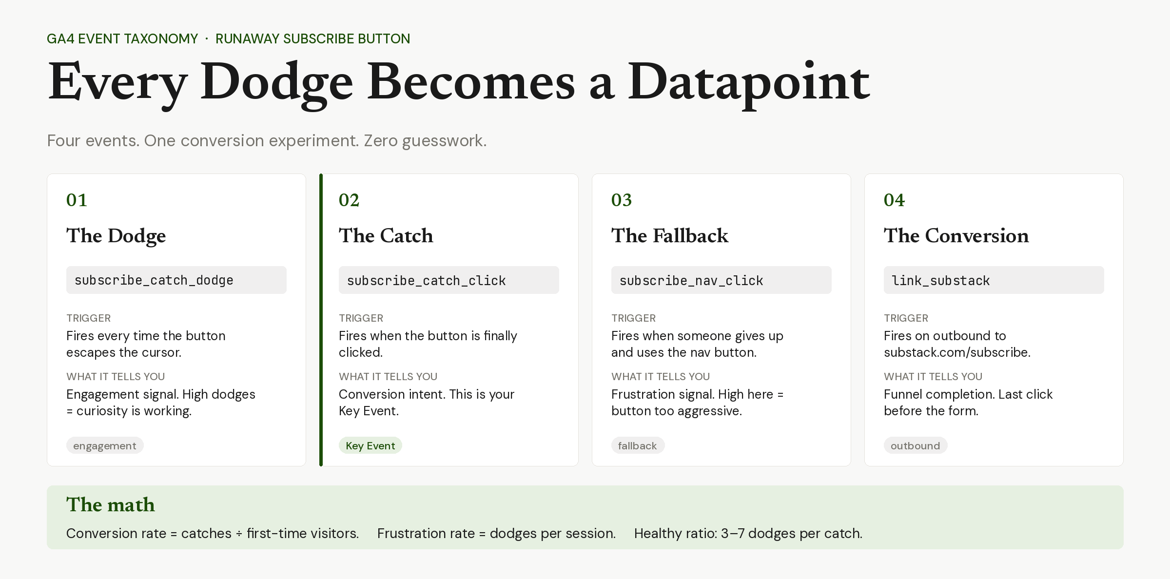
I wired Google Tag Manager and Google Analytics 4, so I can track every dodge, every catch, every outbound click to Substack.
subscribe_catch_dodge
Fires every time the button moves away from the cursor.
Parameters:dodge_count (integer 1-4),
max_dodges (integer, always 4),
input (set to touch on touchscreen taps).
subscribe_catch_click
Fires when the reader successfully catches the button and clicks through to karozieminski.substack.com/subscribe.
Parameters:dodges_before_catch (0-4)
This is the event I am marking as a Key Event in GA4 once it accumulates 24 hours of data.
subscribe_nav_click
Fires on every .btn-subscribe element across the site. Without it I couldn’t tell whether the runaway button is generating incremental clicks or cannibalizing the static subscribe buttons elsewhere.
link_substack and link_external
Outbound link tracking. Standard. Not specific to the experiment but necessary for the funnel.
How To Build A Runaway Button
You can build a runaway subscribe button in two ways: copy working source code, or prompt an AI tool to generate one with accessibility built in.
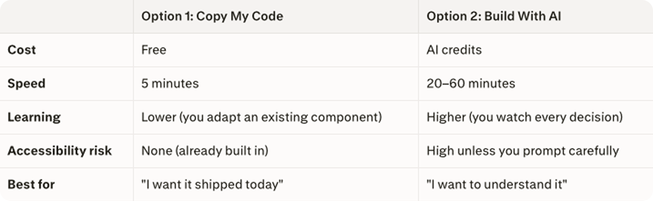
Option 1: Copy My Source Code
The easiest and cheapest way to build this is to copy my code, and change three things:
the button text
the destination URL
the number of times the button dodges before it gives up (just remember that a button that runs forever is not fun anymore).
This route also saves you credits, because you are not asking AI to reinvent the whole component from scratch. You are asking it to adapt something that already works.
Paid members get the full source code, and all the tools and resources I share.
Option 2: Build An Accessible Runaway Button With AI
If you ask AI to build this from scratch, don’t just ask for a button that runs away from the cursor. That prompt will probably create inaccessible.
Use my original prompt instead.
This route is more credit-heavy because AI has to design, code, debug, and explain the component from zero. But it also gives you a better learning opportunity. You get to watch the build happen from scratch, inspect the decisions, and steer the accessibility rules before the button turns into a tiny lawsuit with a hover state.
Paid members get the exact prompt I used, and all the tools and resources I share.
Why Adaptation Beats Generation for Component Work
Adapting working code costs less than generating new code because the architecture is already solved.
When we ask an AI tool to build a component from scratch, we are paying for three things: architecture decisions, implementation, and the inevitable round of corrections when the first version misses our actual context. The first two are expensive. The third is unavoidable.
When we ask the same tool to adapt working code, we pay for one thing: the swap. Architecture is already decided. Implementation is already correct. Context is already encoded in the file we pasted in.
This is the same reason design systems work. You don’t rebuild the button on every page, you import it.
The Challenge
The first two people who build their own accessible runaway button win a free year of Product with Attitude Premium.
Rules are simple:
Build the button.
Keep the accessibility fixes.
Send me the URL.
If you ship one yourself, send me the URL.
I will catch it. 🤗

WHY SUBSCRIBE ・YOUR BENEFITS・ TOOLS I BUILT・CLAUDE HUB・PERPLEXITY HUB ・VIBE CODING HUB
Absolutely bloody love the subversiveness of this. Brill!
Karo , this is so cool 🙌